Ticketmaster is the leading marketplace for event tickets sales. Let’s see if we can improve the experience and discover new ways for Ticketmaster to reinvent itself.
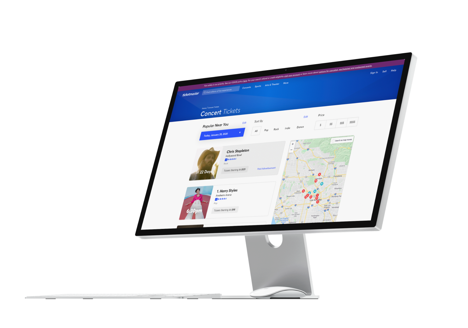
Ticketmaster is the leading marketplace for event tickets sales. Let’s see if we can improve the experience and discover new ways for Ticketmaster to reinvent itself.

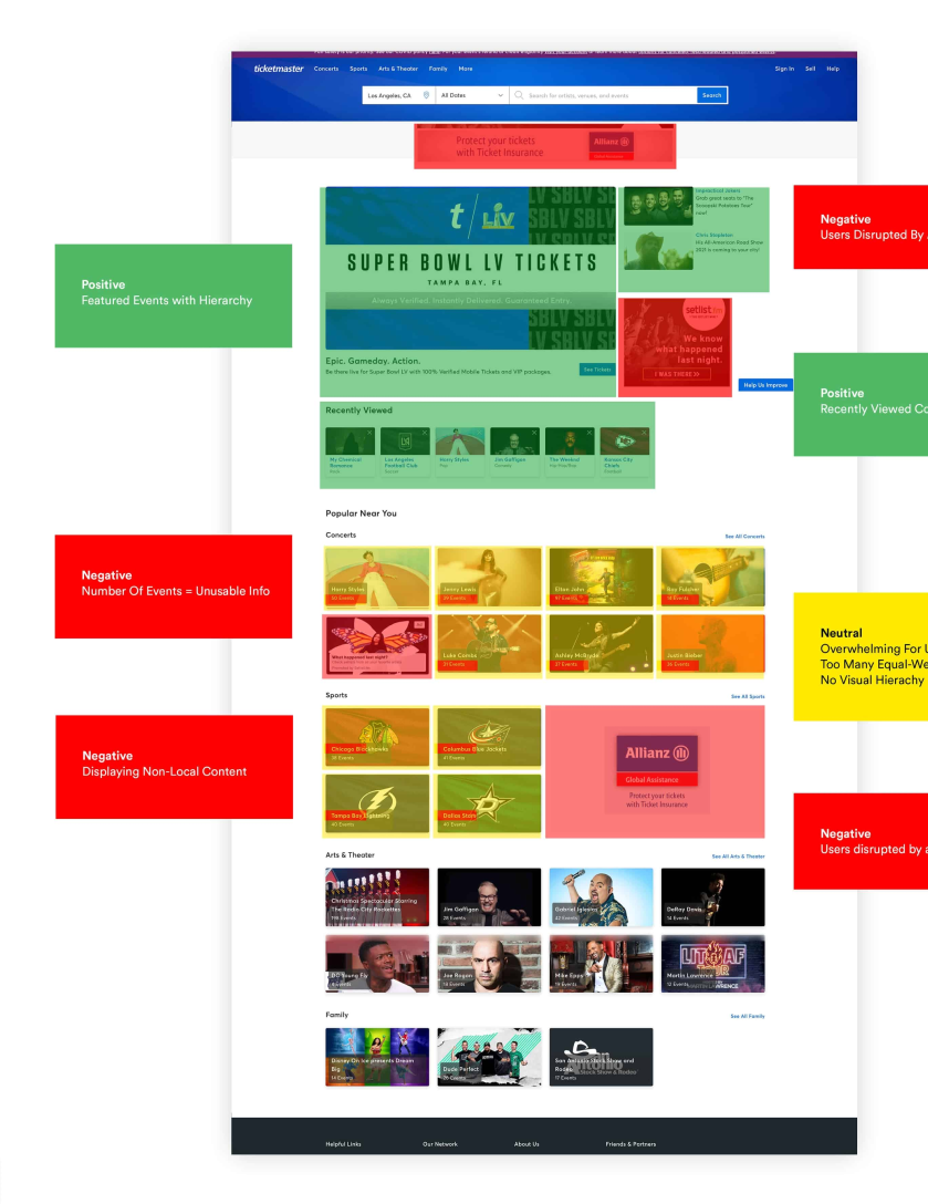
Ticketmaster’s brand is on display, and it falls flat on impact. A background consisting of a generic blue gradient feels stale.
Navigating around seems intuitive but the results consistently left you wanting more curation/editorial selection.
Images on a website are good, although there is a monotony when the same image is repeated over and over for multiple dates/times.
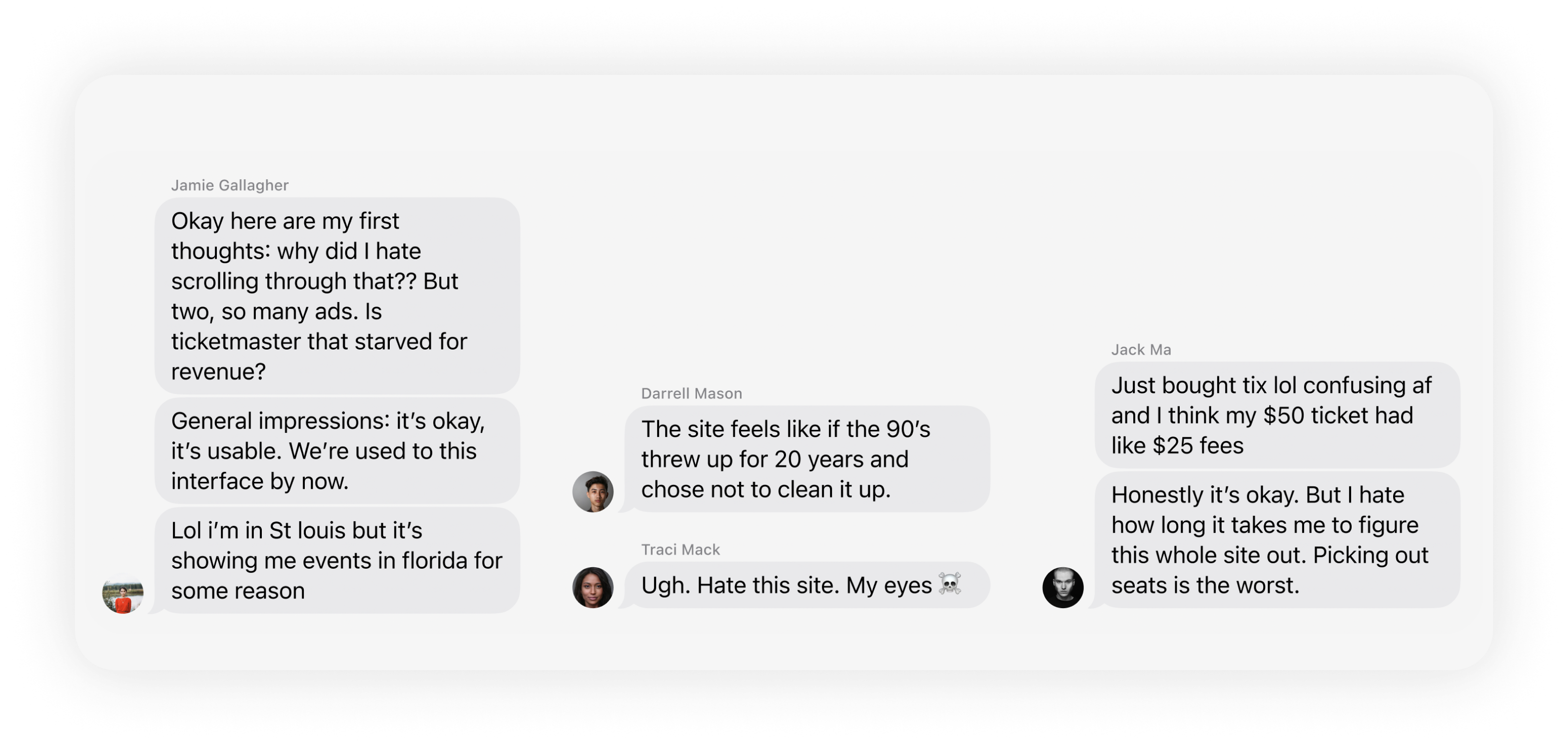
I started asking my circle of connections, an informal survey of 30+ people who were concert goers, and what their experience of Ticketmaster was. Far and wide, there was a very negative tone when it came to the experience of ticket buying.
On top of the enormous fees, most users did not feel satisfied while using the web application, even after buying tickets.
Users also mentioned how difficult it was to discover new events in their area. This seemed to be in relation to the rise of new hyperlocal applications like Yelp & Uber.
Companies like Yelp and Uber have become household names by offering hyperlocal services. By following their example and focusing on providing highly targeted, localized experiences, our company can tap into this growing demand and differentiate ourselves from larger, more generic competitors.
Additionally, a hyperlocal approach can help us to better understand the unique needs and preferences of our customers in different areas, allowing us to continually improve and refine our offerings.
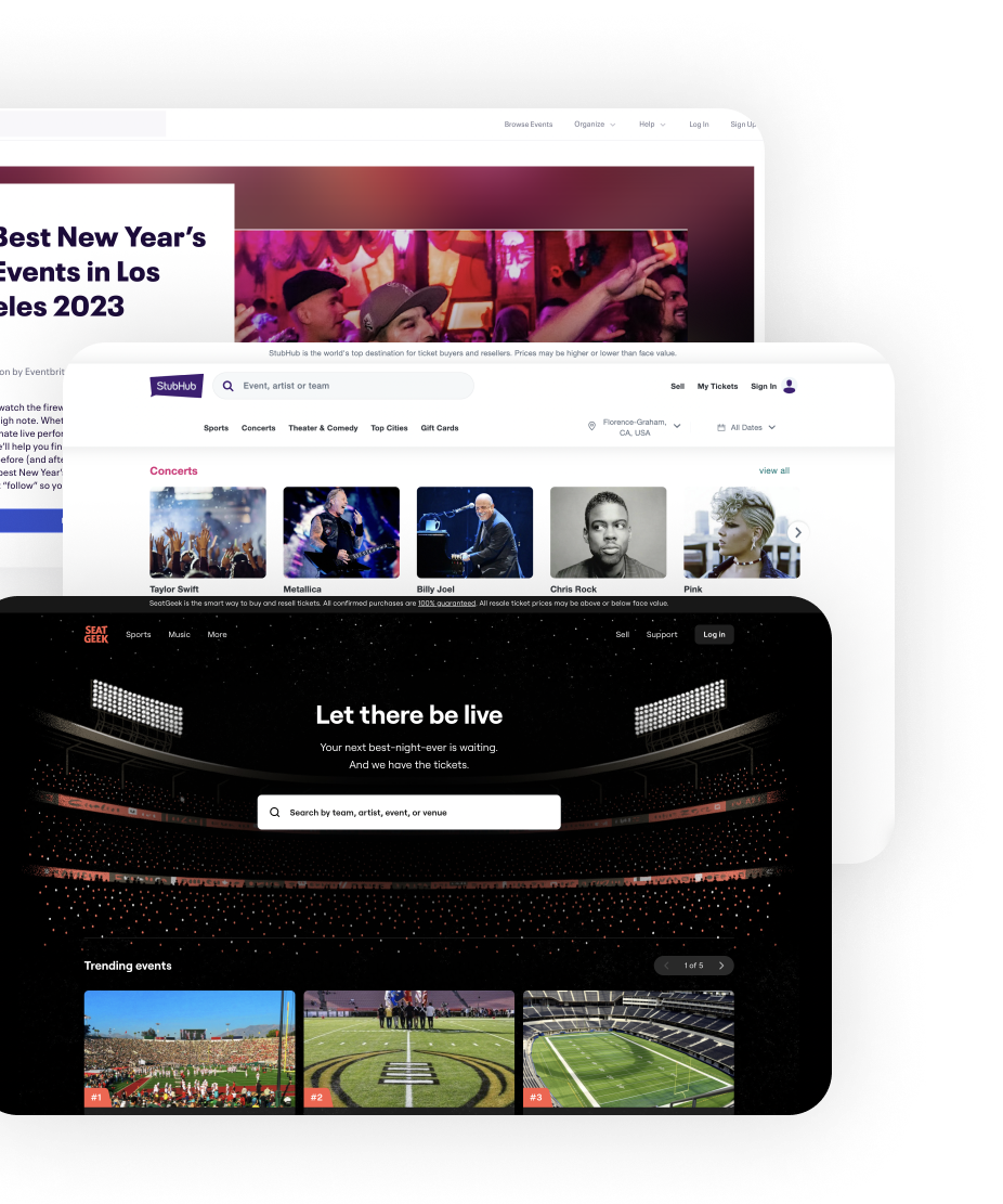

I thought about introducing the concept of a hyperlocal timeline, something akin to Yelp, and see what that would do to the navigational sitemap.
Consider how every page on Yelp or Uber revolves around your location. We want to capture that same spirit but for events.
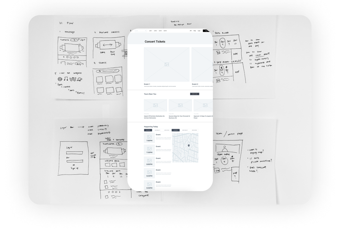
I began by asking users what their internal dialogue was when it came to events and tickets. Surprisingly, their initial thoughts all seemed to revolve being able to answer “what am I going to do today/x-day?”
It felt more like a direct parallel of “what am I going to eat today?” (Similar to Yelp’s UX.) These were primal questions that wants answers and Ticketmaster could be to one to provide those answers immediately.
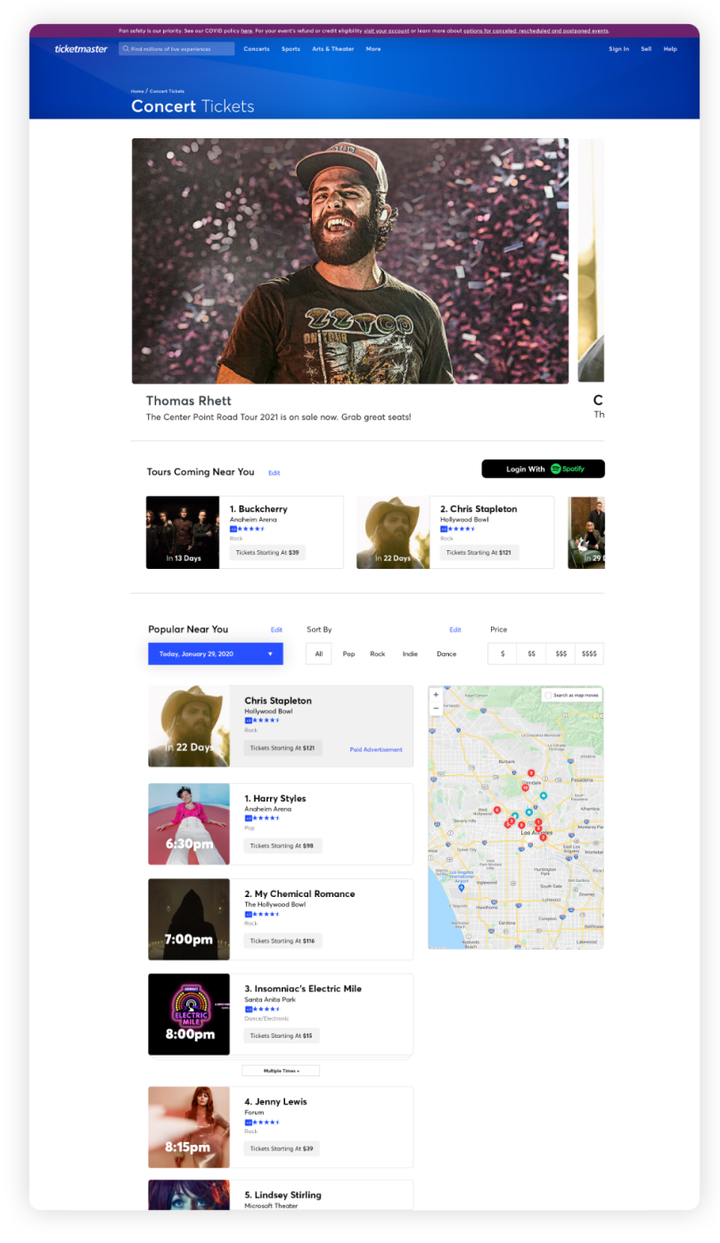
A big focus of the design was to not overwhelm the user with unnecessary information, but to present a clean search interface that had minimum friction: a list of events should they choose to pick or a search box for custom inputs.
An emphasis on the hyperlocal map that updates around you provides new and interesting ways on aggregating their existing data.
I also wanted to double down on the hyperlocal features and decided to also create specific “tours near you” widgets. This makes sure the user knows we are keeping a pulse of everything.
There’s also a feature to login with your Spotify account, and the engine will highlight any tours coming around you, based on the artists you already listen to.
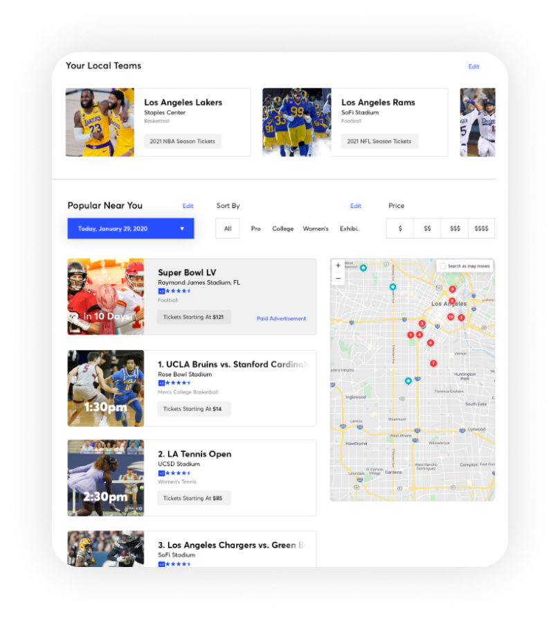
Another look inside specific categories: Sports. For specific big market cities, we can roll out a display that emphasizes the local sports teams. This could help drive even more data and ticket sales considering team and brand loyalty.
Advertisements like the Superbowl now don’t seem out of place because of it’s surrounding context. You could even package event tickets with merch eventually as add-ons.
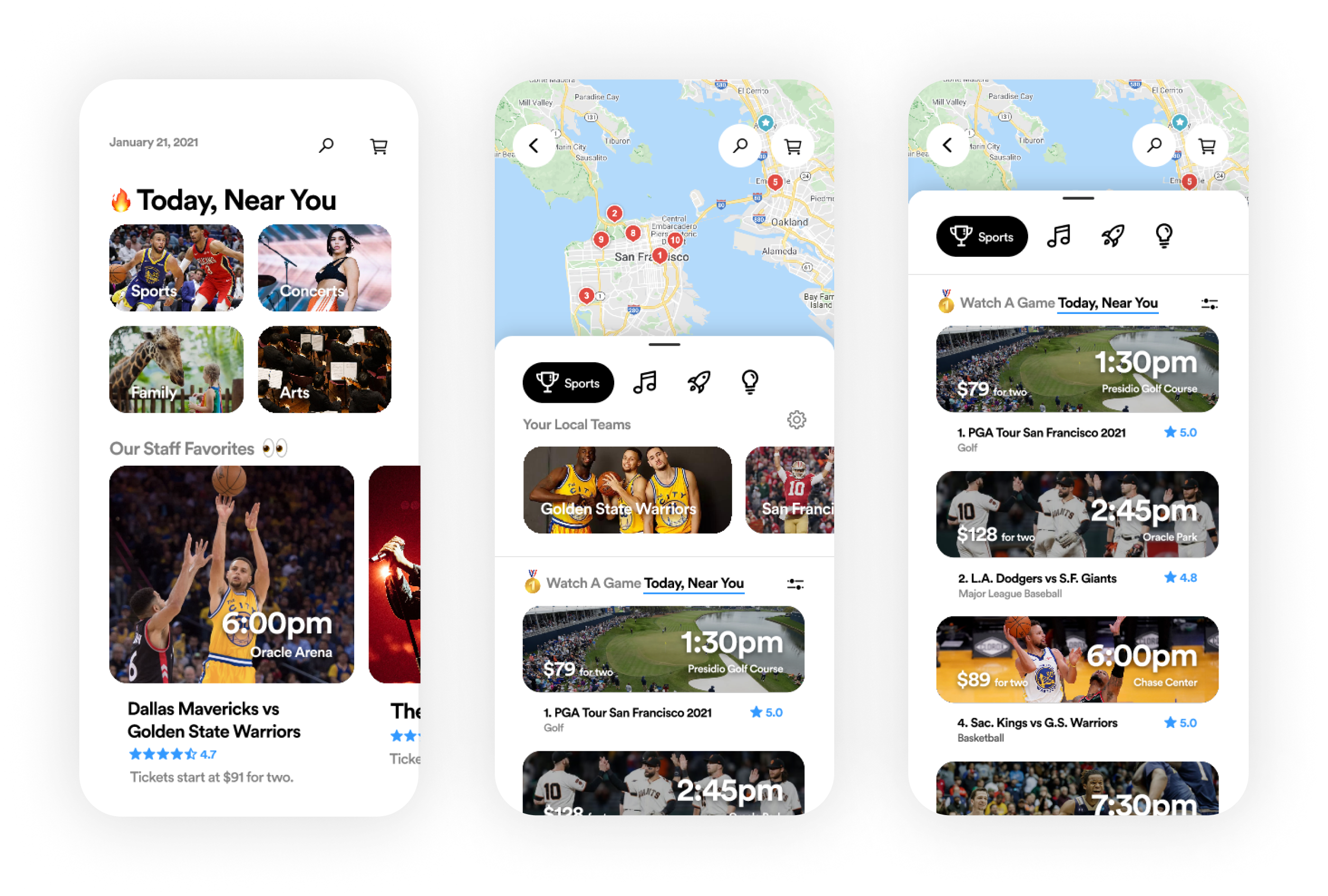
I wanted to challenge myself and see if we could push the boundaries for event discovery. I decided to design and prototype a brand new Ticketmaster app that is focused on all the changes mentioned above.
Timeline focused and catered directly based on your location. Sports teams, musicians, family events, and the arts can all be filtered and sorted based on your preferences.
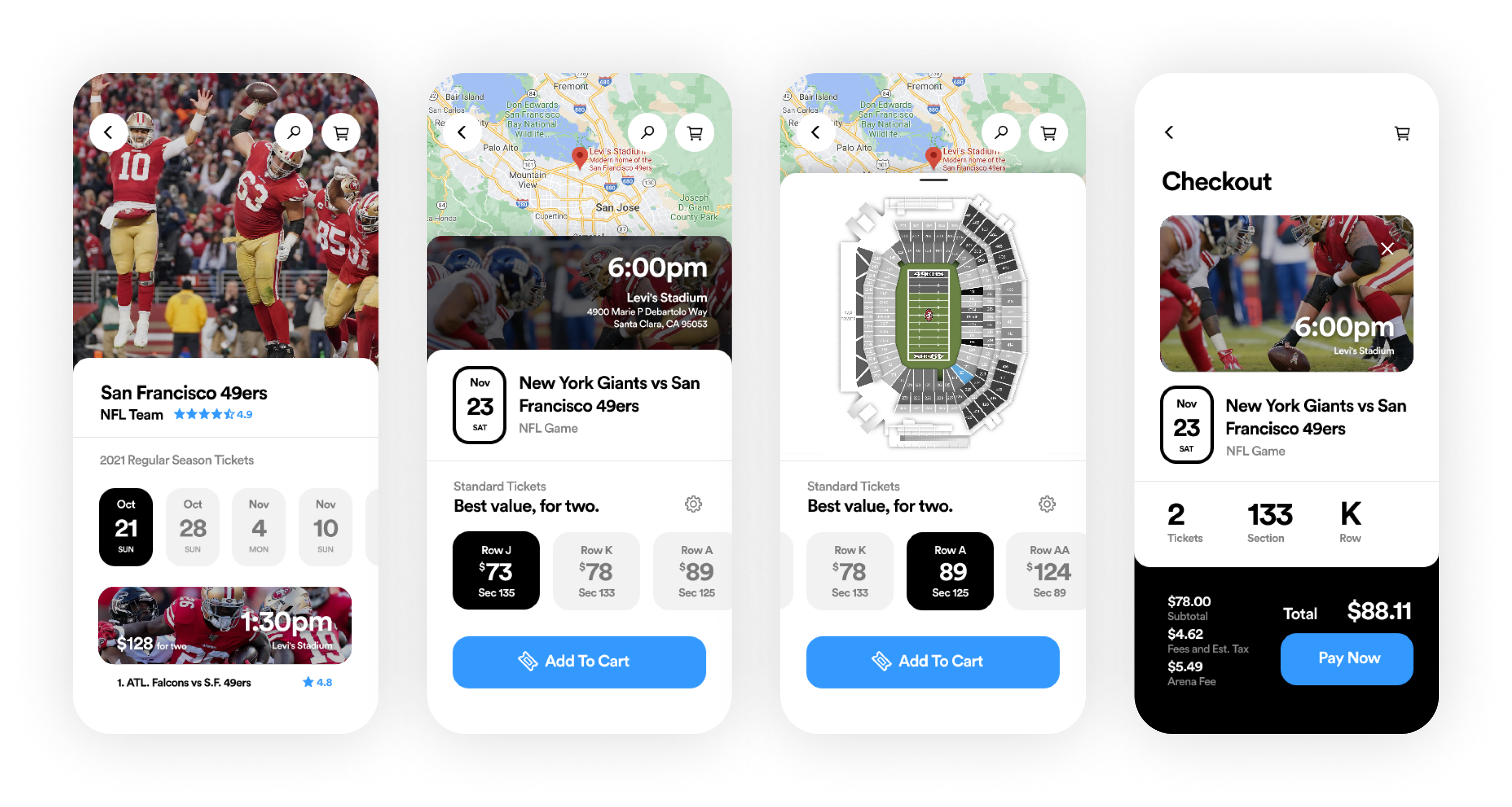
Part of the fun of this project was reimagining the cart/payment solution. I think we can really simplify things for average users and help them with a big visual interface.
Ticketmaster could default to different ticket packages, encouraging people to get the best ticket value with others. Ticketmaster could even match you with certain people so you can benefit from the discounted price.
I think this is a very interesting vertical for Ticketmaster to go after -- and they would simply be reusing their existing data.
The process of designing was really exciting and rewarding and there were times I felt a different creative flow because this was purely driven by curiosity (and not a paycheck.)