Horizon bridge is new blockchain technology with a public-facing application that allows for near instant transfer of assets from one network to another.
Horizon bridge is new blockchain technology with a public-facing application that allows for near instant transfer of assets from one network to another.
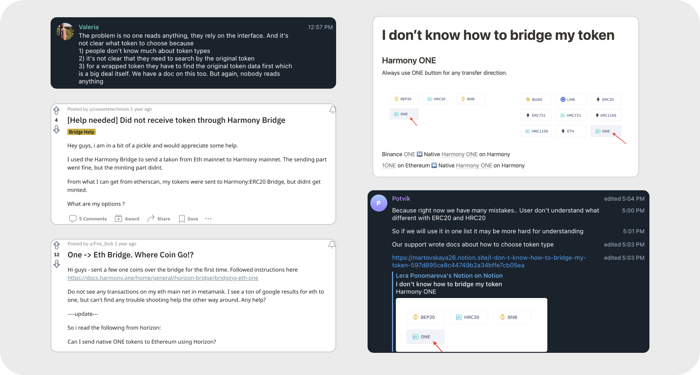
We began receiving multiple pings a week from users who were stuck at certain parts of our application. Our interviews with them showed that our current interface was simply too confusing for users to understand.
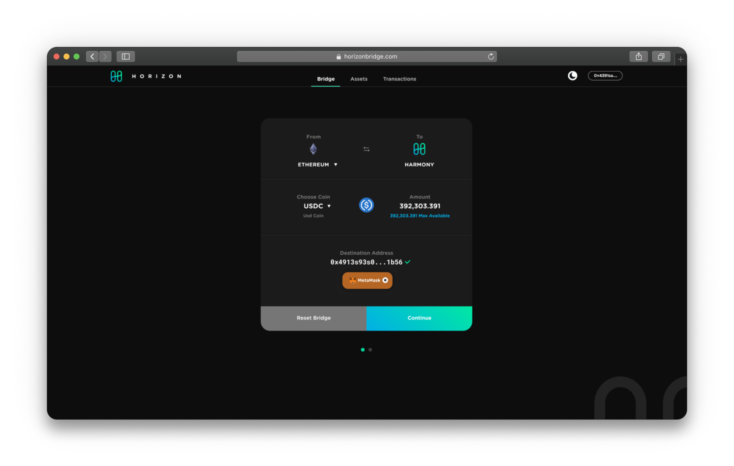
Because of the complexity of the transaction, it turns out most users were still being given options to click on that should not have been clickable.

Visually, the homepage offers a strong brand design but suffers from lack of contrast. It’s hard to determine which screen offers information and which lets them control the interface.
Navigation on the interface is where the application fails. There are too many options available at every stage, leading users to accidentally click on non-interactive options.
With over $1.5 billion transferred through this interface, we knew there were enough users who used this application, but our users were clearly being failed with the experience.
We did a quick competitive analysis on the status and design of other similar blockchain applications, and most did the very thing we were not: allowing the software to eliminate unnecessary options for the user.
This was a bit of a wake-up call for us, and it made us realize that we needed to up our game if we wanted to remain competitive.

Our target audience was being tracked through analytics and we were indeed attracting a lot of people from 18-40, most who had previous exposure with their tokens and wanted a way to expand into our ecosystem.
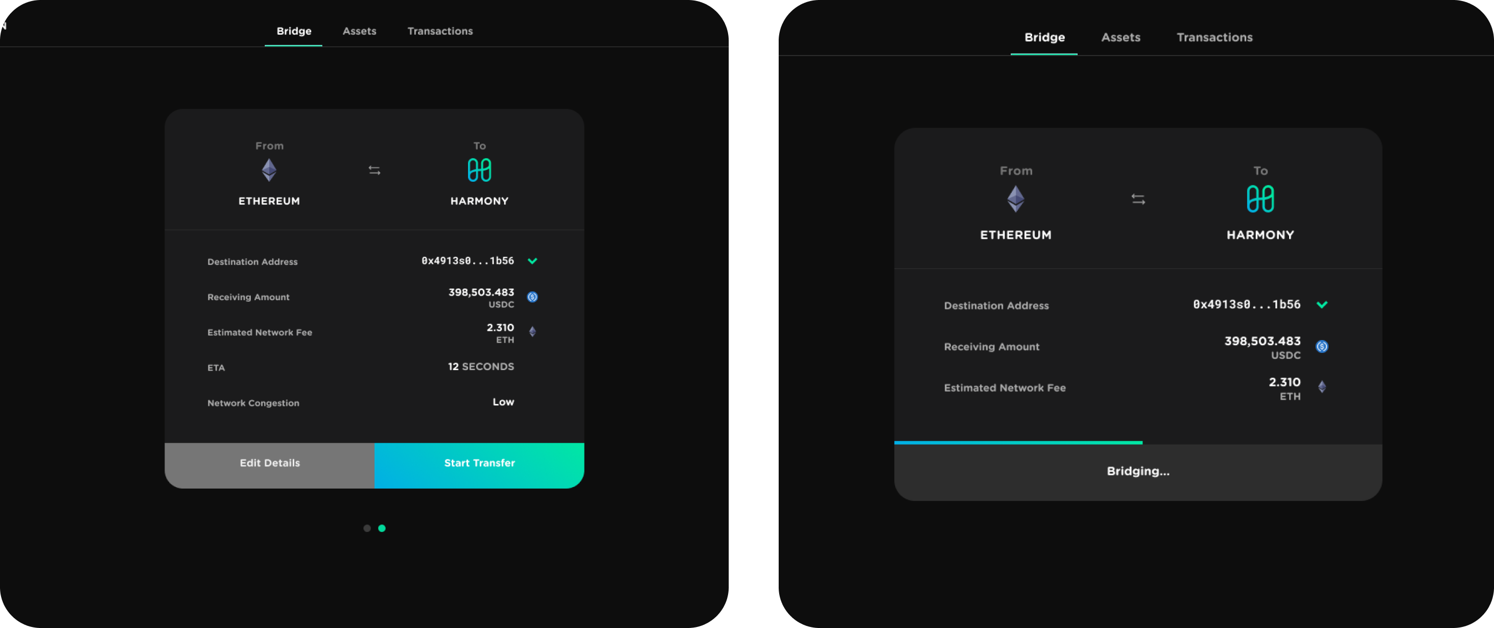
UI that helps the user avoid seeing unnecessary options the further they go along the transfer and auto-detecting what is already inside their wallet.
Even with the help of AI, we needed to visibly aid the user whenever they did something right or wrong. Tooltips would be needed along the way.
Once the transfer has begun, we wanted to show a visible graphic aid that would show them where they were at in the process.
After the research phase, we wanted to incorporate very functional features so our core audience would feel taken care of; like they were being taken care of on other protocol tools.
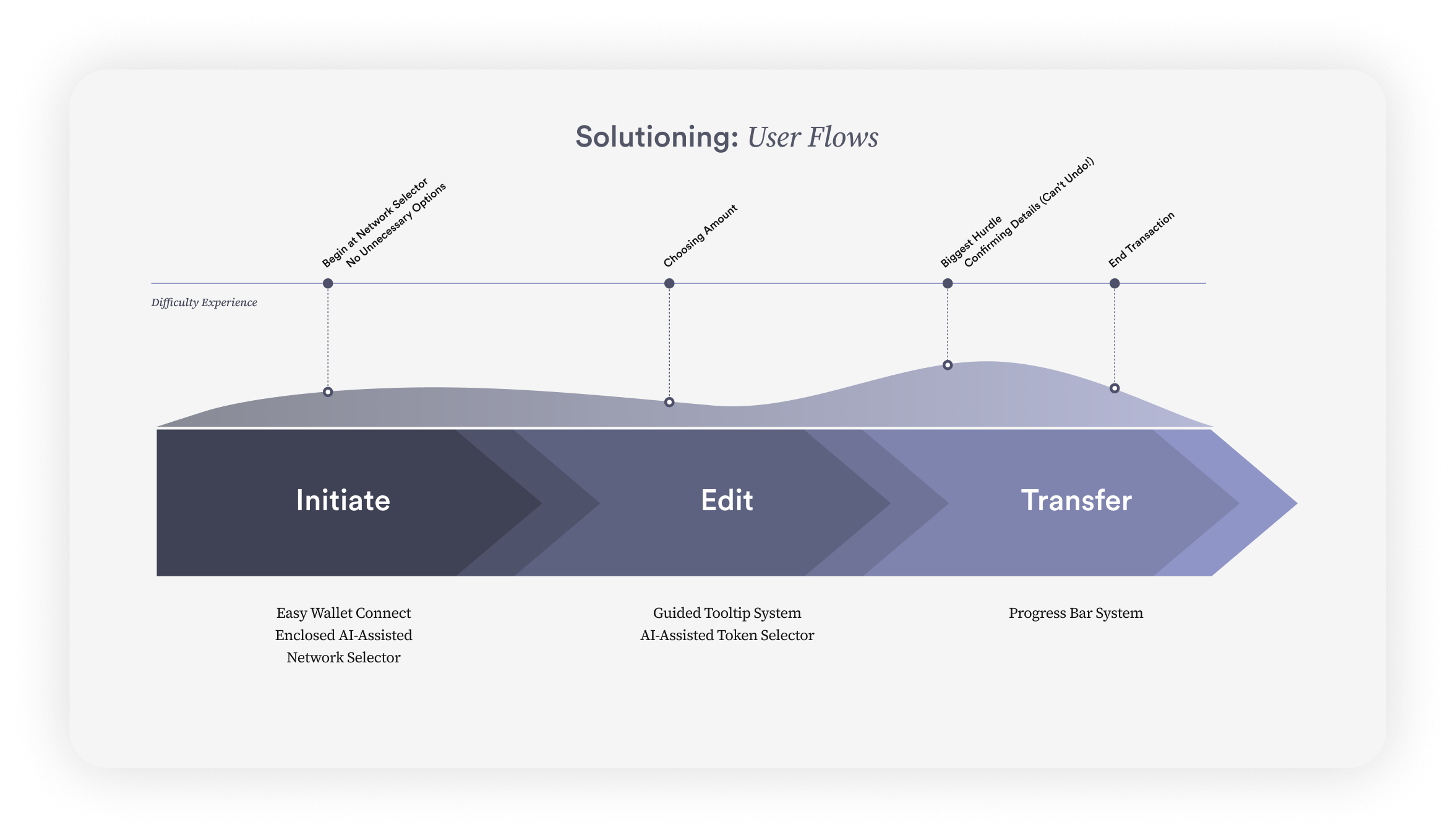
Because the web3 industry is so nascent, I set out to imagine a new solution that used AI to help eliminate confusion. The workflow was simple in that they would have tooltips and a smart UI system that walked them through a full token transfer process.

I started with several ideas and eventually landed on a few renditions that all centered around the same concept: a central modal box that would contain everything the user needed, and nothing more.
This little box would serve as the blueprint for the entire app, and placing everything inside would guide all of the design and development decisions.
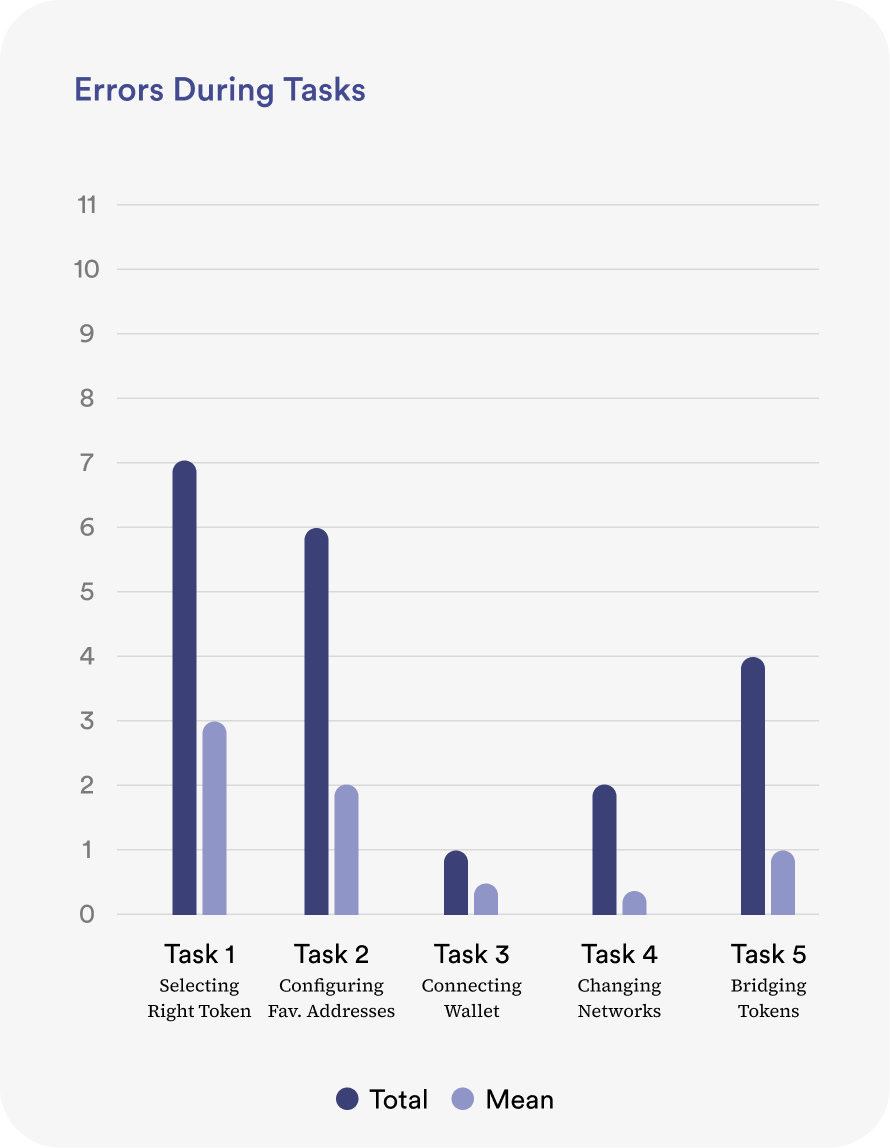
In order to determine if the design made sense, I took these wireframes and conducted usability testing with our users. The usability test was broken out into several tasks: selecting the right token, configuring their favorite addresses, connecting their wallet, changing networks, and finally bridging their tokens.
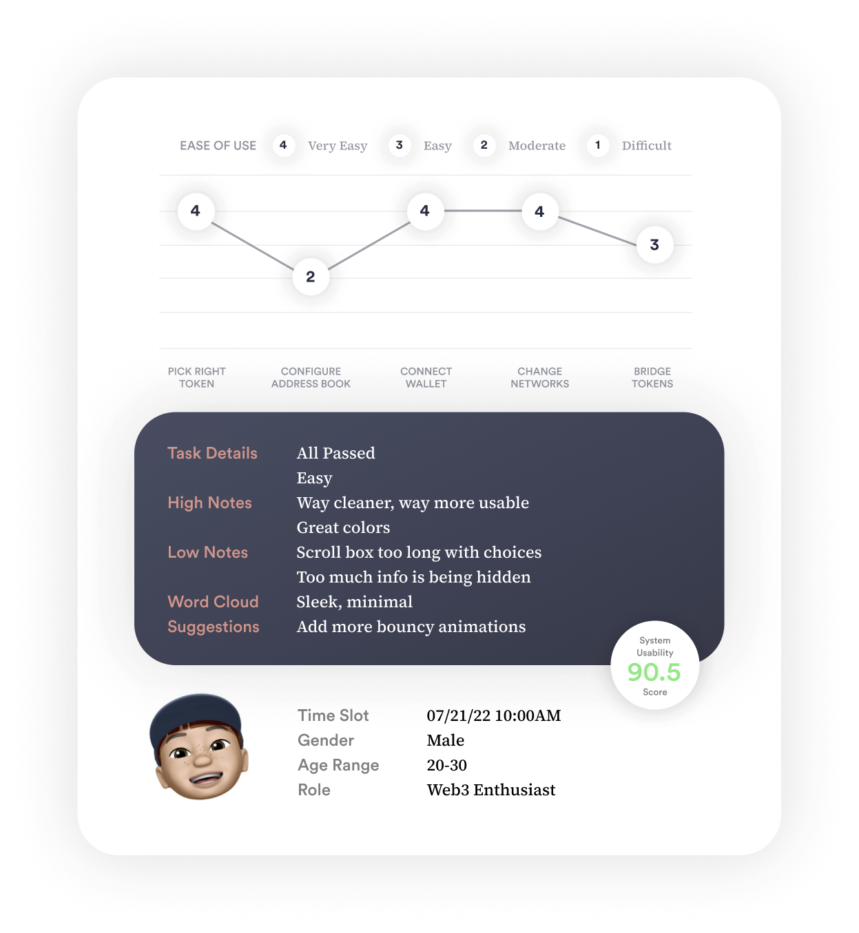
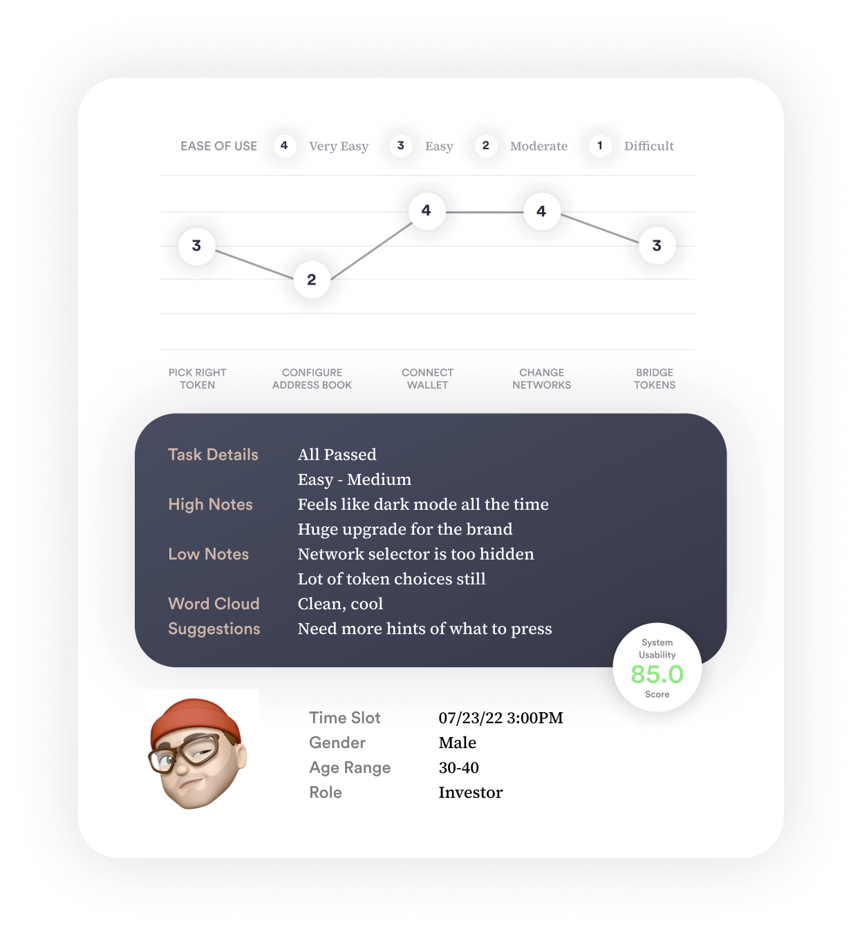
Users rated their experience with a simple system usability survey, they were timed for each task, and they gave me qualitative feedback on how it could be improved. The feedback we received contributed to changes we made for the final design.

We wanted the app to feel modern and cutting-edge, and we spent a lot of time experimenting with different design elements and concepts.
We also experimented with different user flow ideas, and we tested out various animations and transitions.
We wanted the app to feel modern and cutting-edge, and we spent a lot of time experimenting with different design elements and concepts.
We also experimented with different user flow ideas, and we tested out various animations and transitions.
Users were grateful for the changes we had made to the app, and they had some amazing things to say about it.
Many of them mentioned how user-friendly and intuitive the app was, and how much they appreciated the friendlier design. One request they still had was to give better loading screens and update the progress bar as it goes so it made it into the next revision.

The end UX succeeded in helping users use the protocol with newfound ease.
Up to 80% Decrease in contacts/queries over transactions/errors
Users rave about the new design
One challenge I faced was dealing with conflicting feedback from different stakeholders. There were a lot of different opinions on what the app should look like and how it should function, and it was sometimes difficult to reconcile these different perspectives.