Santa Monica College is a public community college in Santa Monica, California. Founded as a Junior College in 1929, SMC enrolls over 30,000 students in more than 90 fields of study.
Santa Monica College is a public community college in Santa Monica, California. Founded as a Junior College in 1929, SMC enrolls over 30,000 students in more than 90 fields of study.
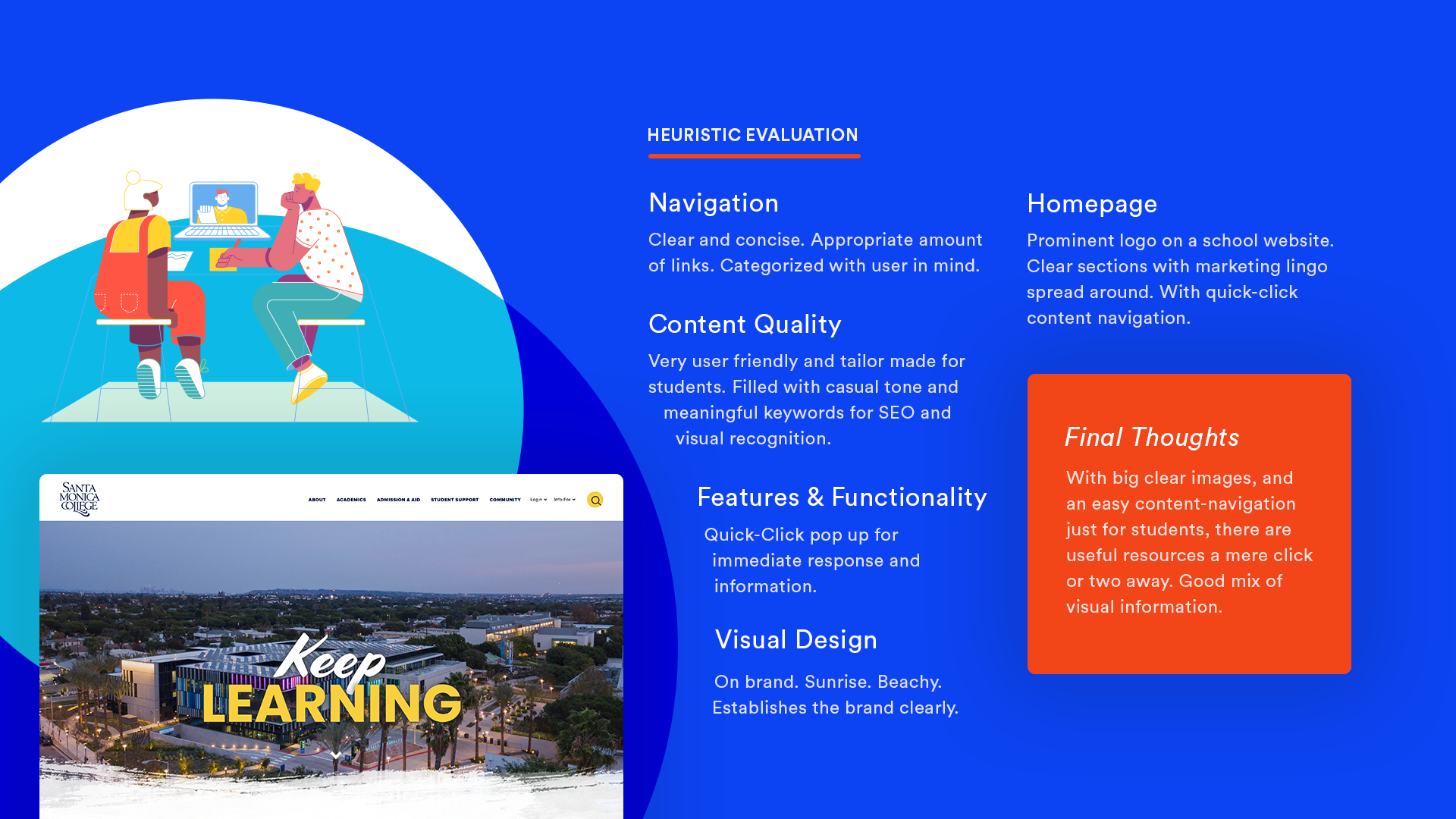
First and foremost, the website's layout is clean and organized. This means that different sections of the website are clearly defined and separated, and the text is easy to read. SMC achieves this.
SMC has a pleasant looking website because it also utilizes a cohesive and attractive color scheme. The Homepage shines here.
The images on the website were also used in a way that enhances the user's understanding of the information presented; the sunrise, the beachiness. Very nice.
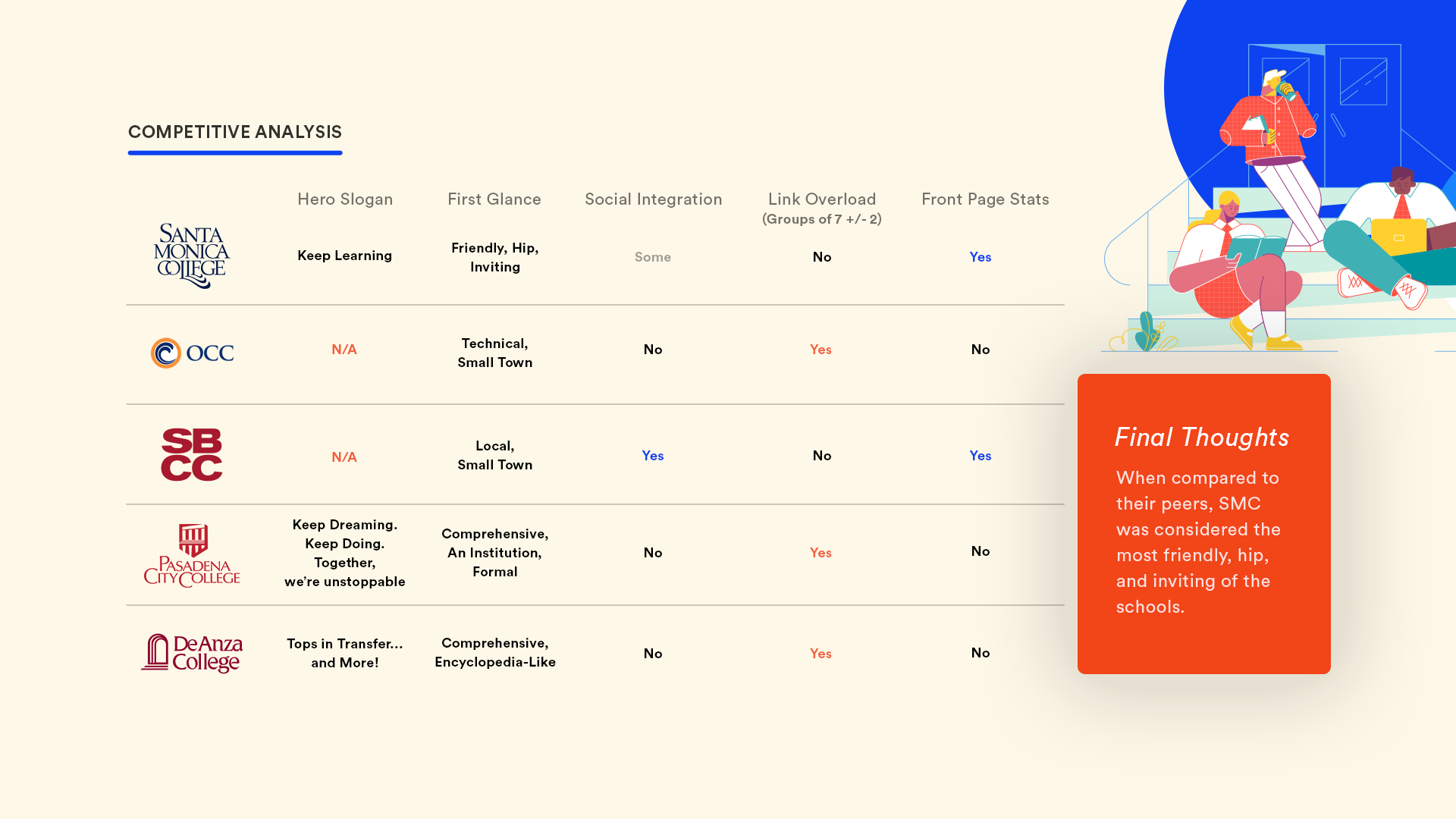
Other colleges decided to take their own route. Some places use big hero slogans, while others would rather let the curriculum and their numbers shine. SMC’s “Keep Learning” is nice a simple.
Beyond that, visitors believed that the website and school felt “Friendly, Hip, Inviting” -- something that sets SMC apart from most schools.
It is also clear SMC is reaping the benefits from strong UX curriculum, the front page has a pleasing flow to it.
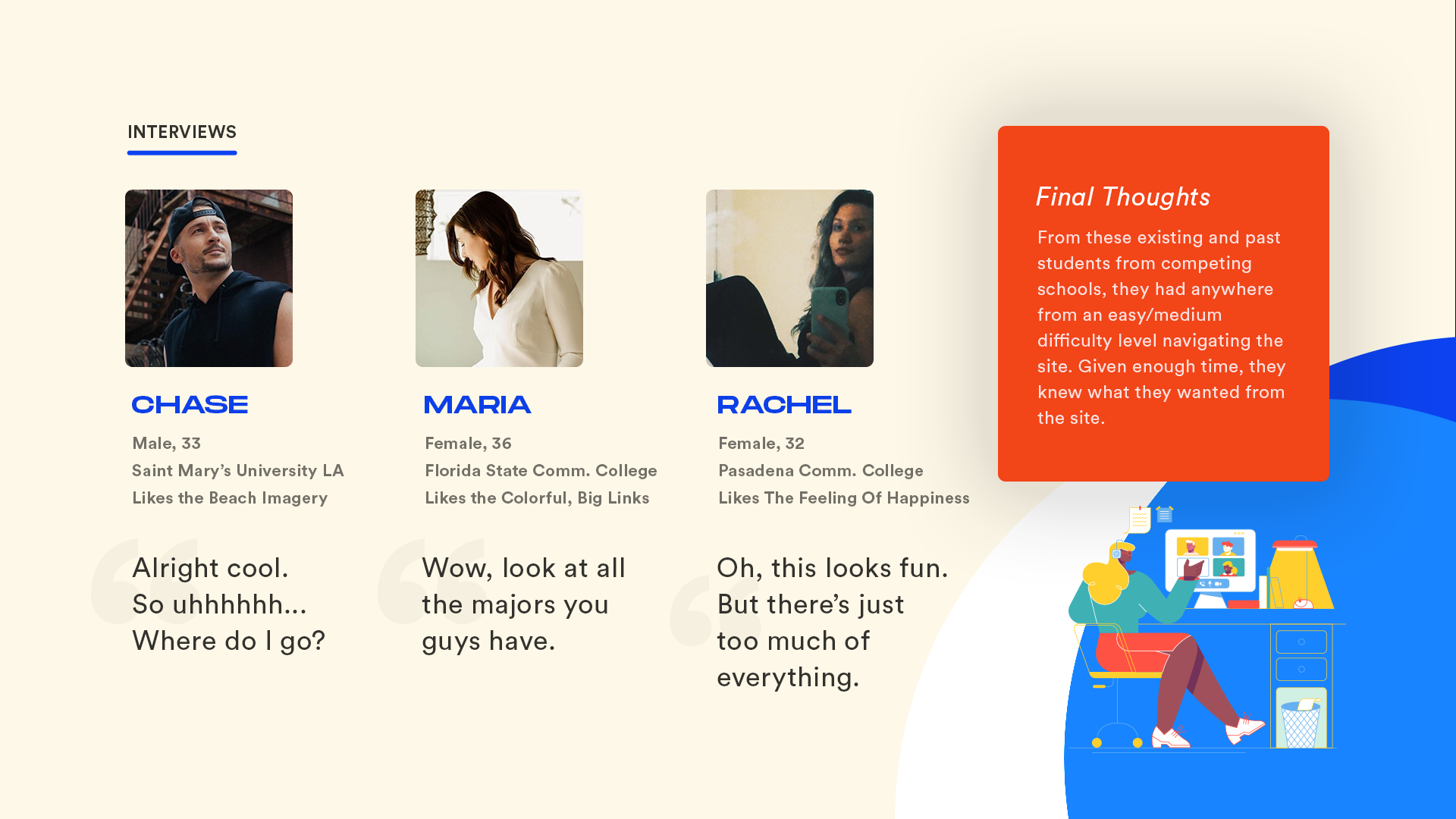
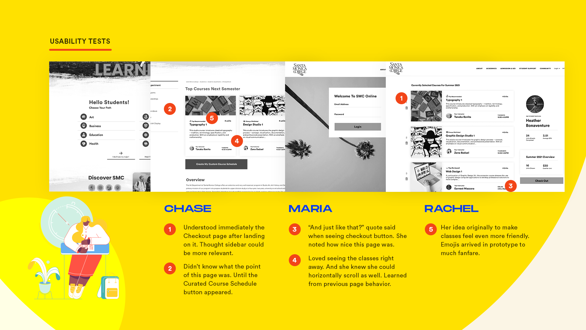
I polled three particular students and gauged their interest in Santa Monica College; some as prospectives and another as a transfer.
For the most part, they had an easy/medium difficulty level in navigating the site. And given enough time, they were able to navigate through the site thoroughly.
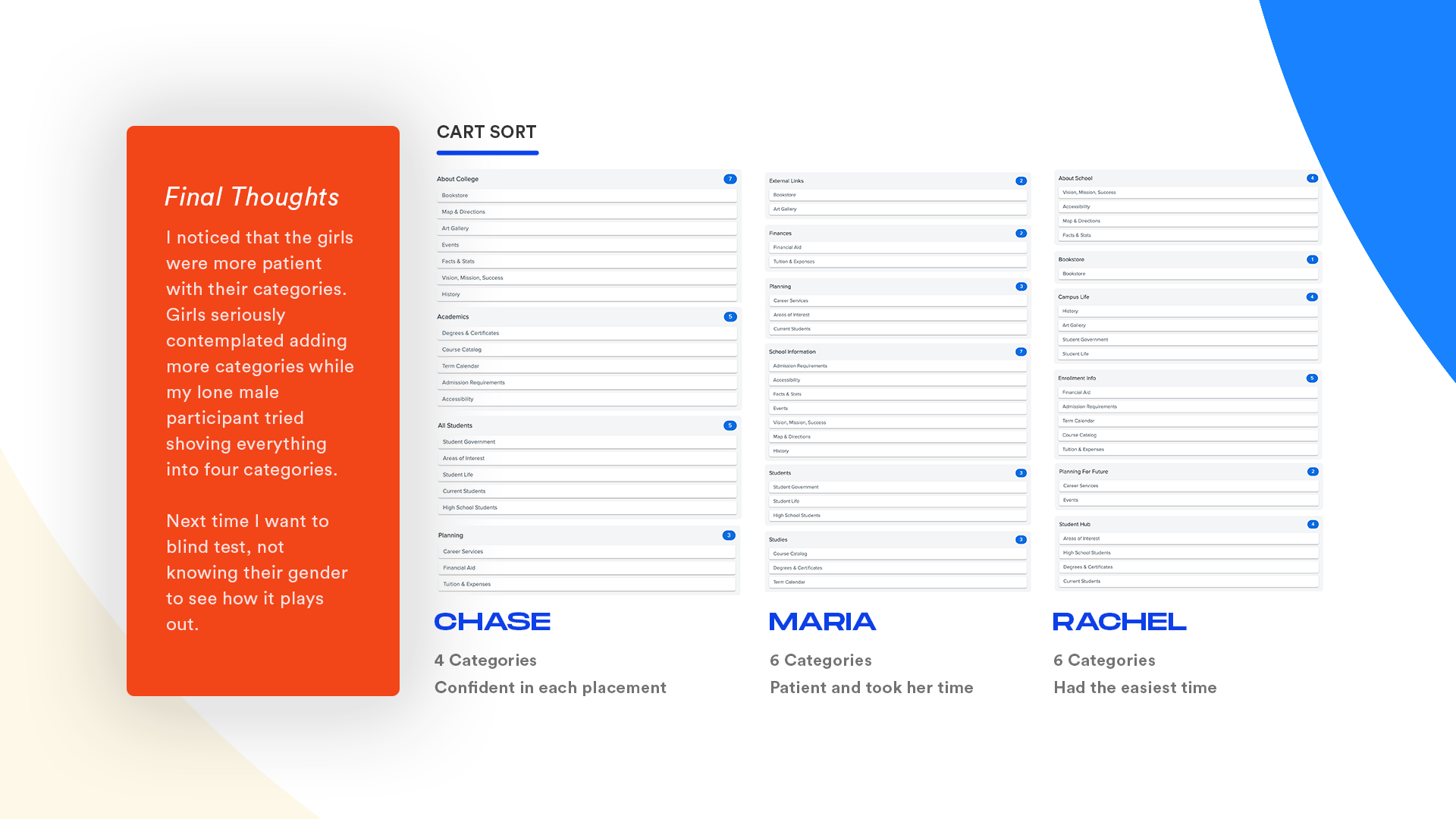
By organizing the cards into groups, we could see how different elements or categories might fit together and can identify potential navigation paths that users might follow.
Overall, this card sorting exercise gave us insights into how users think and can help to create a more user-friendly website.
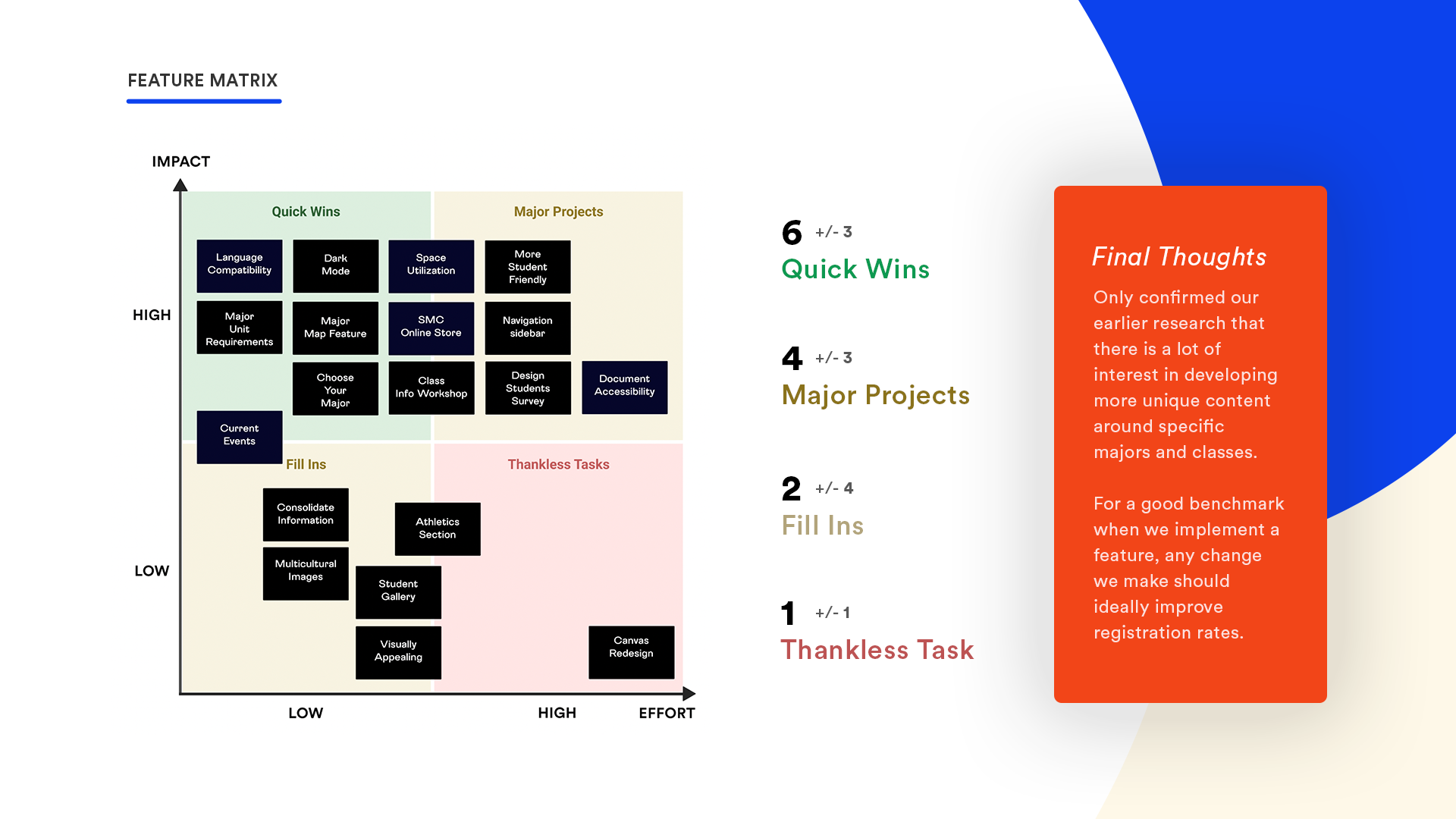
My original goal was to fill in the Quick Wins box, as they seem to get the ball rolling on bigger projects. A pattern continued to occur however; most of the quick wins were all focused around majors and courses.
Thankfully, this gave us a blueprint for which problems to tackle first for maximum value.
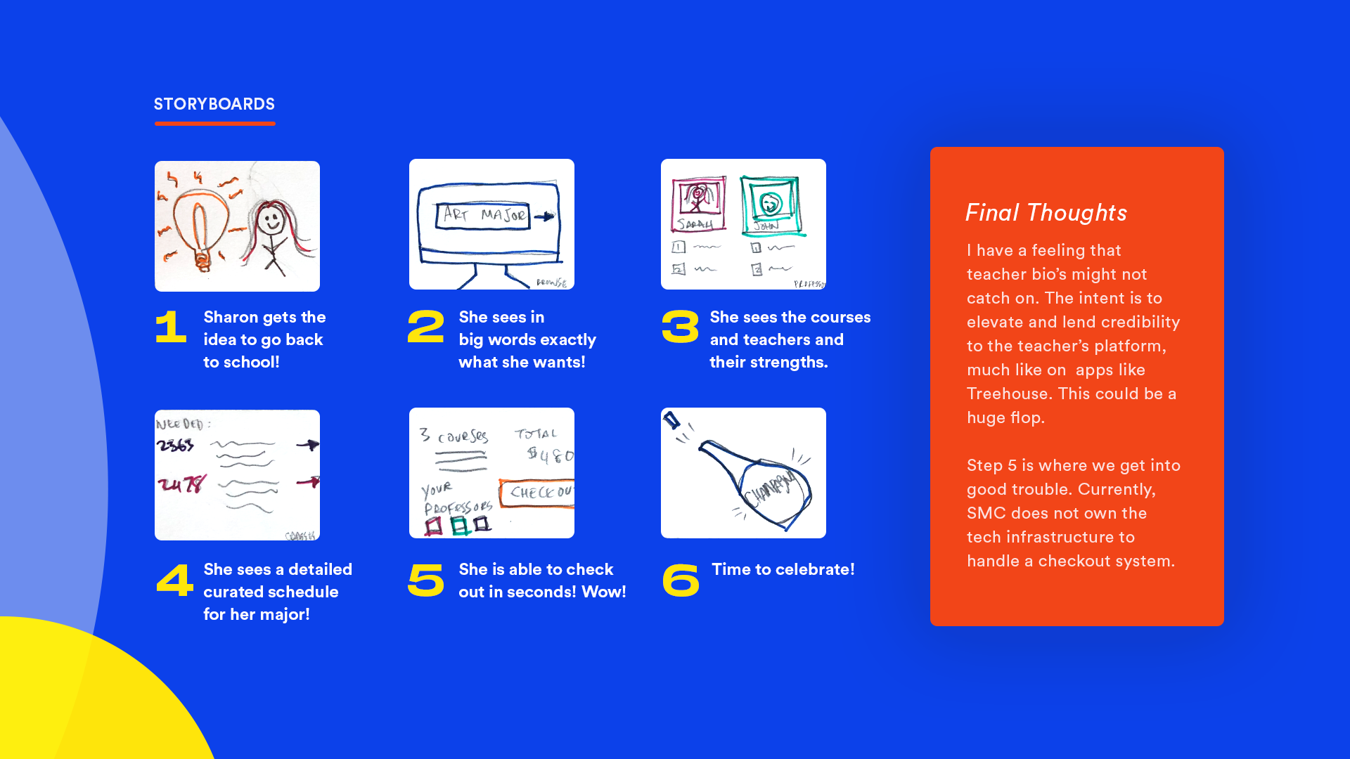
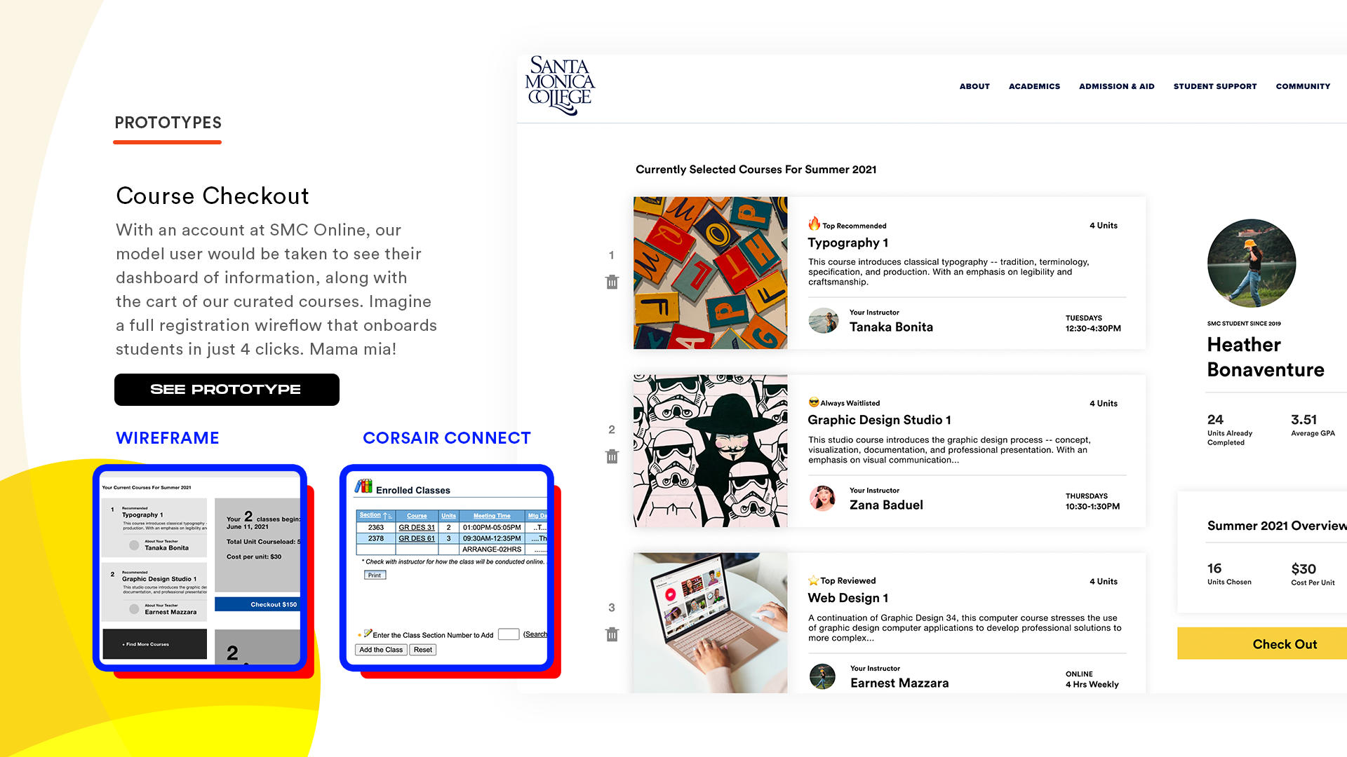
I jotted down a fictional character’s journey from starting onto the website, to seeing which courses to take, to paying for the courses, ideally in minimum steps possible.
One piece of feedback was the emphasis on the teacher’s biography; it might be too much effort for little impact on which course to take.
Also, for maximum impact on this, SMC would need to own the “checkout” portion of the process; something that would require a deep infrastructure overhaul.
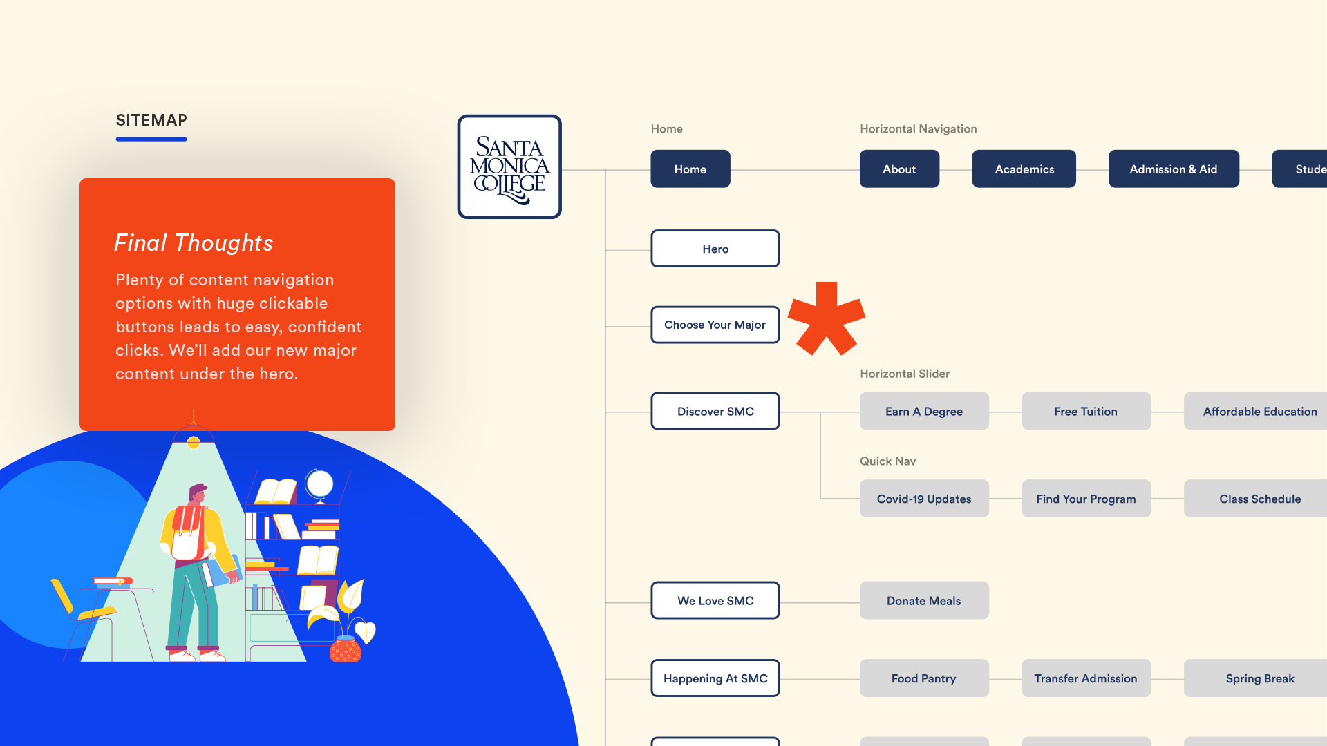
The biggest change in our sitemap was to include relevant major information directly below the main hero. It was a great way to capture direct eyeballs for students who needed help.
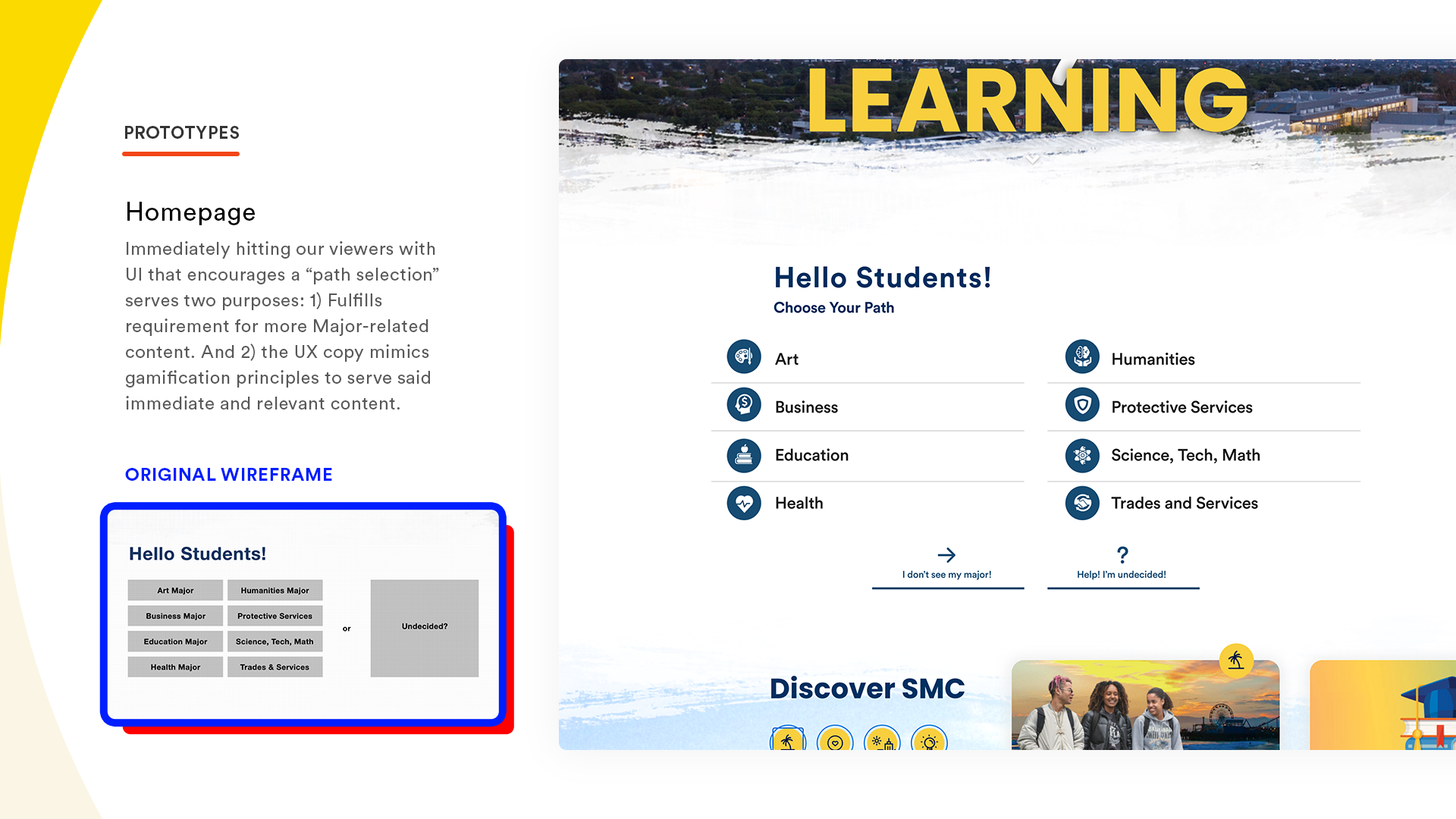
Directly below the hero, we begin to introduce a flow for students who are already focused on their particular career. We can already offload a huge amount of student visitors to their necessary destinations as fast as possible.
And big icons helps students identify with their specific path, like skill trees in gamification strategies.
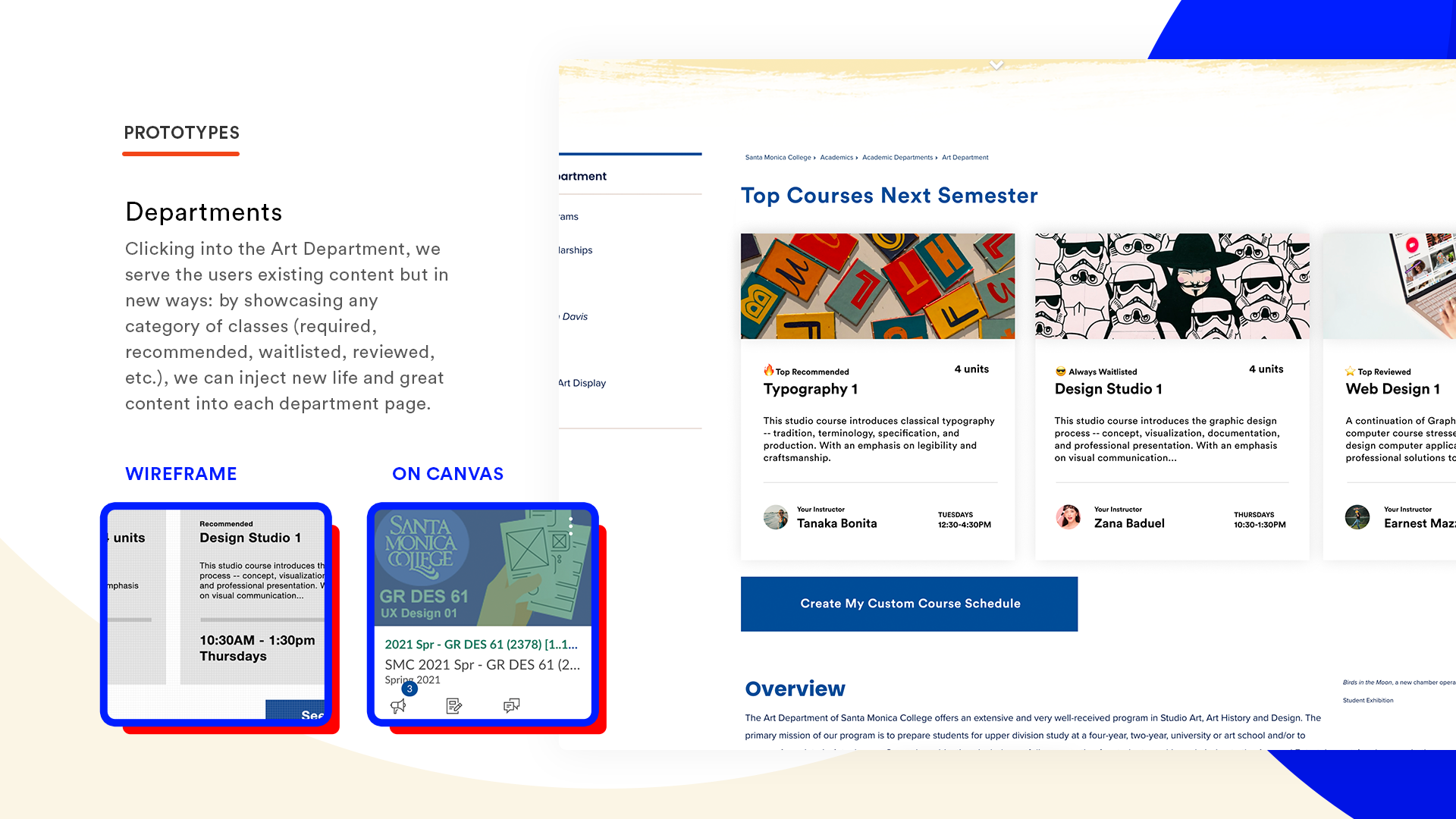
Another addition was to spruce up the main courses for each specific category. Highlighting courses helps students know exactly what they need to be taking.
Tags would be a welcome addition and updating each course with new and colorful imagery is a huge boon for the user experience.
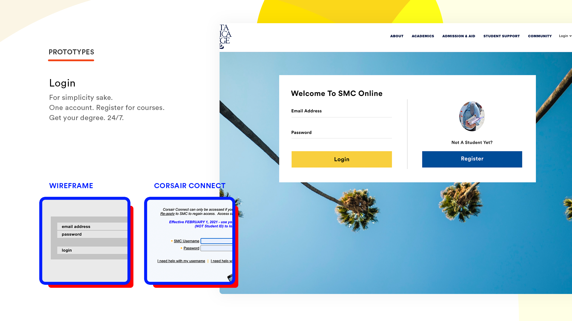
Something on the wishlist was to combine Corsair Connect with the actual SMC backend, enabling one account to do everything college related.
This would obviously be a huge infrastructure change that might be out of scope of this project.
Redesigning the corsair connect interface would be a major project, but one that could bring major dividends in user experience.
A self-contained checkout process and a revamped profile would reduce user confusion.
Users were shown design prototypes on Photoshop and the reception was generally positive.
One piece of feedback was to include emojis, and we eventually added them to the tags.
Reflecting back on this project in general has been a great experience. I remember learning many valuable lessons, especially needing to listen to user feedback.
Aside from the major overhaul changes, I still think SMC can achieve some good quick wins with major related content.