1Wallet is a new messaging iOS app based on secure and private Web3 communication protocols and aims to be the first social wallet. I helped 1Wallet shape their brand and user experience.
1Wallet is a new messaging iOS app based on secure and private Web3 communication protocols and aims to be the first social wallet. I helped 1Wallet shape their brand and user experience.
Multiple user’s were interviewed weekly, over Zoom and Discord, and were given formal surveys to take. Most questions revolved around their usage and thoughts of the app currently.
Our most die-hard fans, users who were on the waitlist for months, all asked for more things to do on the messaging app. Usage was dying off and we knew there wasn’t enough stickiness.
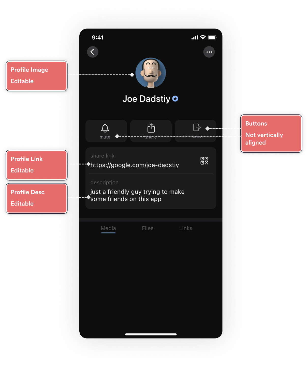
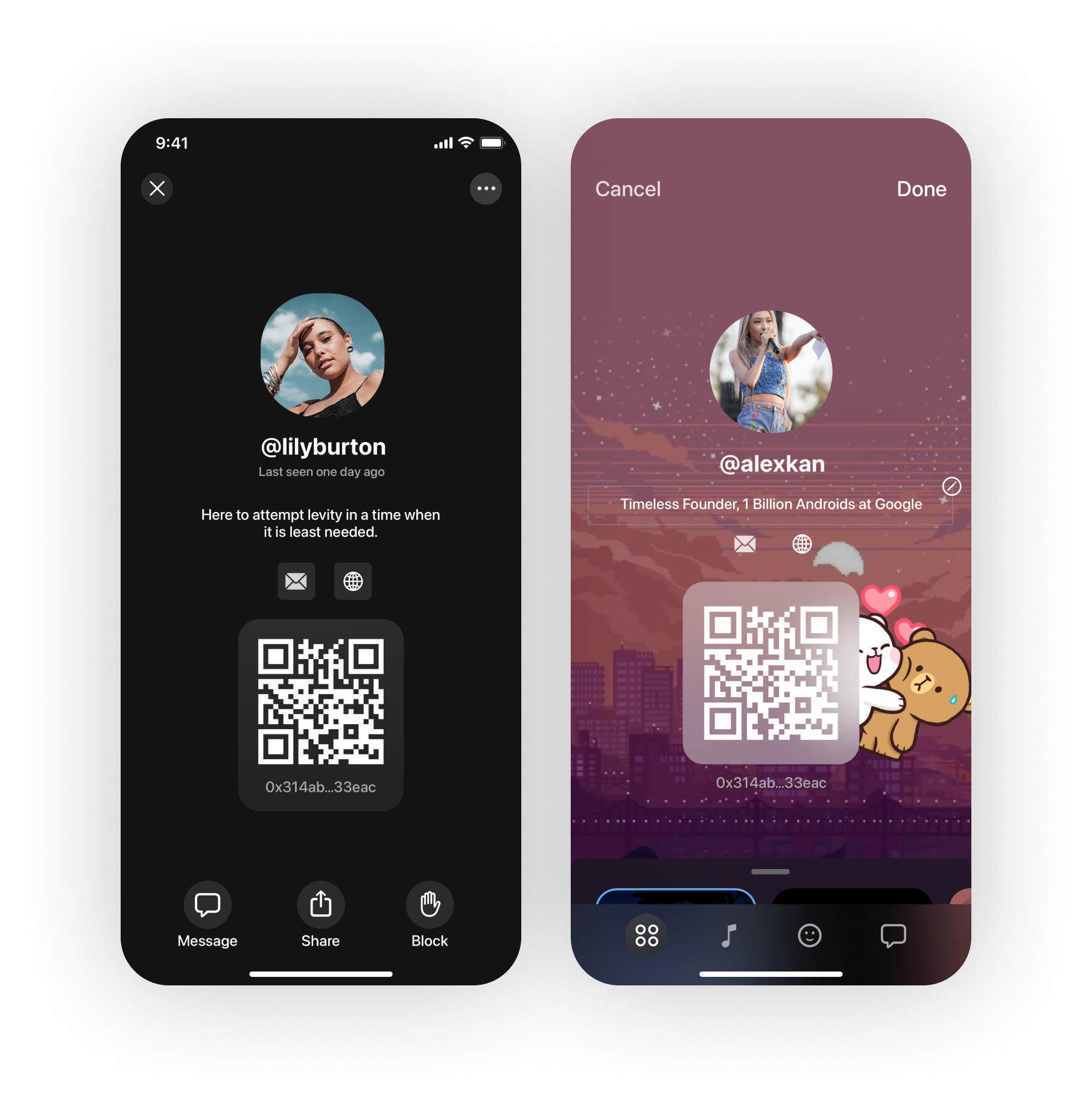
The current interface of our profile page was pretty simple, it came with minimal branding aside from our classic dark mode colors.
There was a social feature here where we turn supplied social media handles into clickable buttons underneath their username. We also offered a timestamp of when they were last seen online.
Navigation wise, they can return back to the previous screen or they can click the ellipses button on the top right to edit.
All of this seemed to scratch an itch but we needed to go ask the users what they thought of the profile page, what they use it for, and why they use it.
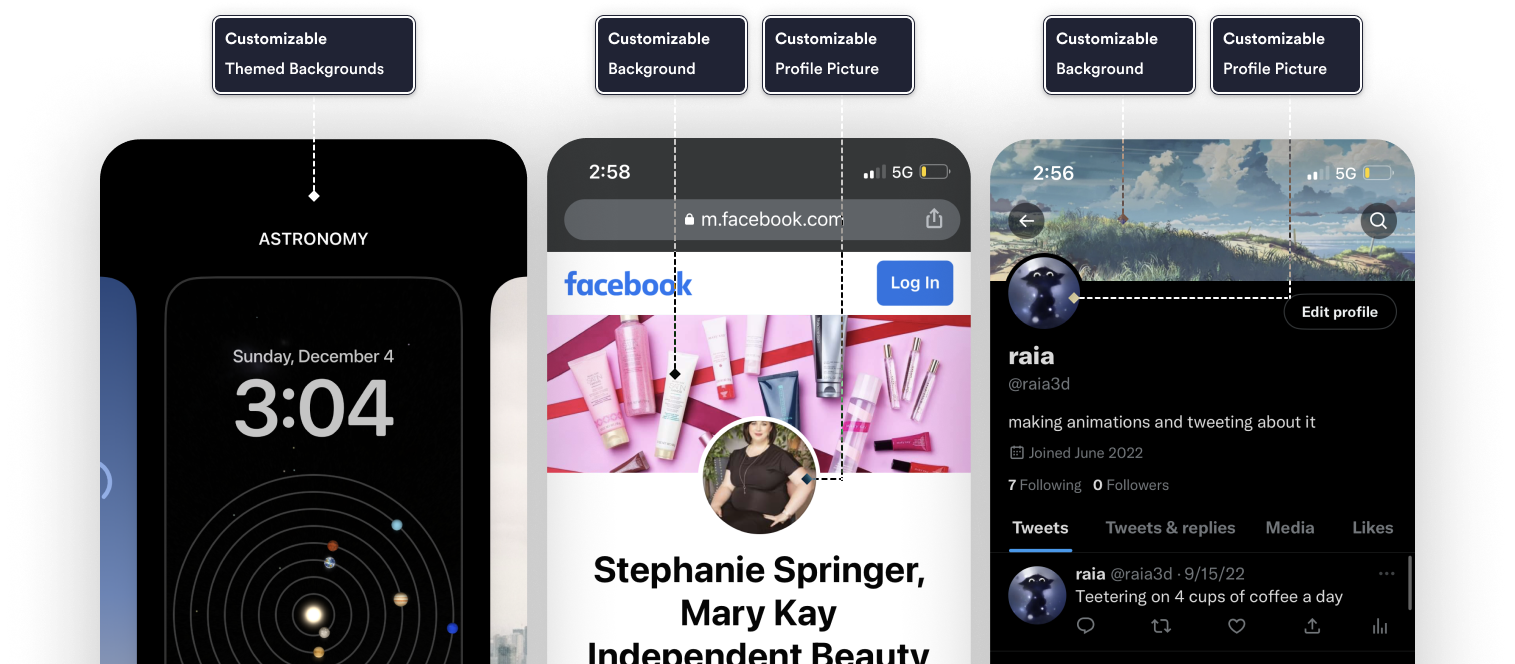
A competitive analysis of other social messaging platforms showed a huge emphasis on the user’s ability to customize. Apps like Twitter, Facebook, Apple’s UI all gave the user multiple ways to make the app their own.
Our application analytics showed us less than 20% of users updated their profile photo over the app’s default avatar. We took this as a sign that our interface was severely lacking in joy that most gen z’s were used to.
Based on user surveys and our waiting list signups, our target audience was a very young mix of creative professionals from 18-30. We knew they were primarily tech-savvy but we wanted the app to feel fun for a variety of users.
One-tap to fully edit the profile based on default themes, with the option to purchase or sell other user-driven themes in a store setting.
Drag and drop sticker/animated-gif UI for users to further customize their profile. With ability to resize or add multiple stickers through search and drag and drop.
Add ability for users to access popular platforms like Spotify and include their own song as part of the profile, with the same drag and drop UI that the stickers used.
After the initial research part of the project, we wanted to target creative professionals who were used to the level of customization that other applications were giving and exceed those expectations. With that, we came up with a list of features that a solid MVP would have that would let them feel like they were in complete control of their profile.

We had a few different ideas to use as a launch pad for our solutions, and I was able to imagine what a dense profile page could mean for our users. I created a simple workflow to take users through, one that included changing the theme, customizing their look, and sharing it with users.

Our proposed solution was overhauling the profile system altogether and replace it with a robust, customizable one that could open the possibilities for user personalization.
The biggest benefit of wireframing was that it allowed me to bring all of the different stakeholders together and get them on the same page.

In order to determine if the design made sense, I took these wireframes and conducted usability testing with our users. The usability test was broken out into several tasks: changing their profile avatar, adding songs to the profile, adding animated stickers, sharing their profile with others, and changing the profile theme.
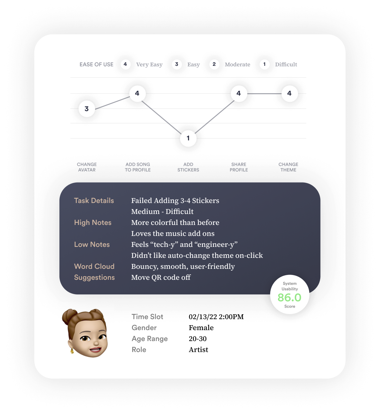
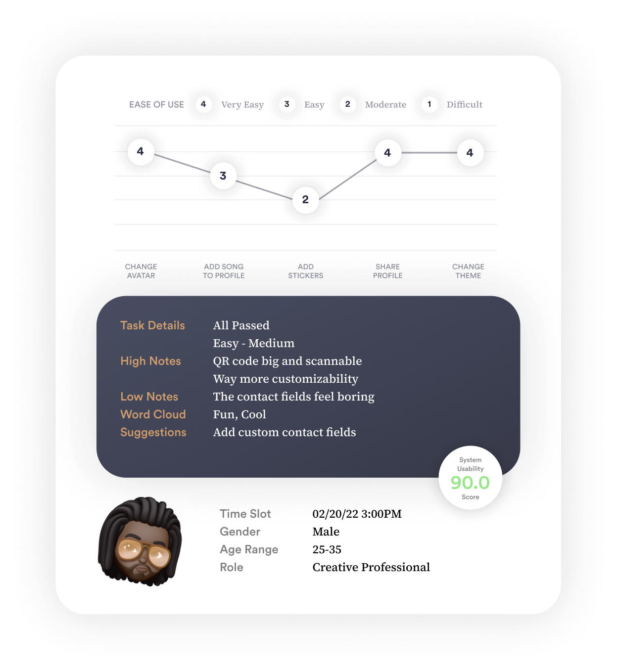
Users rated their experience with a simple system usability survey, they were timed for each task, and they gave me qualitative feedback on how it could be improved. The feedback we received contributed to changes we made for the final design.
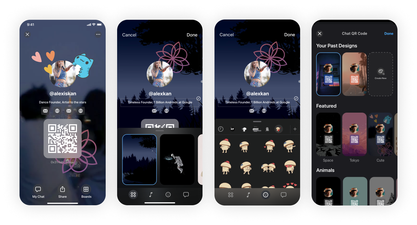
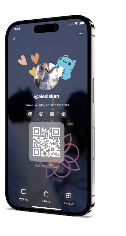
After a coat of design paint, the interface was beginning to come together. Users would be encouraged to choose aesthetically-pleasing backgrounds and stickers, hopefully giving them something that would be shareable with their friends.
In the end, the app had more ways to customize and personalize one’s account. We even designed and engineered in a new digital store for future roll out.
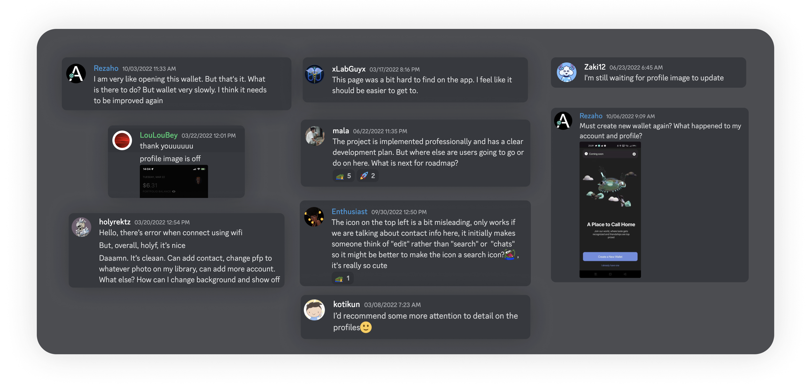
We reached back out to our power users and asked them to share their thoughts and feedback on the new personalization features the app was shipping with. I was amazed at how helpful and insightful their responses were.
We made some design changes to create a more learnable experience, but I am keen on doing a few more usability tests to determine if we are losing any users during this new, profile creation system.
>45% Increase of Profile Changes
+18% Increase of App’s Daily Active Users
One lesson I learned was the importance of staying flexible and open to change. As the project progressed, I had to be willing to adapt and make adjustments to the design based on user feedback and other factors.